
What Are Styled Components?
Please share this post if you enjoy it!
What on Earth are Styled Components?
CSS in JS has been taking the react world by storm recently and among the libraries leading the charge is one called Styled Components. In this tutorial we will take a dive into what Styled components are and try to see the wider problem that the CSS in JS movement is trying to solve. I’m hoping by the end of the article you will have a better understanding of the what and why of Styled Components.
NOTE: This is a beginners tutorial. I won’t go into any advanced usages or best practices. I am simply trying to illustrate the concepts
At the most basic level, Styled Components is just a way of attaching CSS directly to your React components instead of having them in a separate CSS file. The traditional way of doing it will CSS files means you have to use class names in your components and that limits the kind of dynamic styling you can create. At least, it is not that straight forward to create dynamic styles. It would involve having many different classes in your CSS file and manipulating what classes are present on the components at any given time.
This is a far from ideal process. The problem stems from the mismatch in the mental model we have of our components and the way the world actually is when our CSS is in a different file. We usually think about components as one single, coherent unit that contains structure, logic and style. However, having the CSS in a separate file breaks that mental model and creates an impedance mismatch.
Enter Styled Components
Some clever people saw this mismatch as a problem and came up with a way of attaching the CSS directly to our components - inside the javascript file. And so the CSS in JS movement was born. Styled Components is just one of many popular libraries that implement the ideas behind CSS in JS.
Having the styles inside the javascript comes with some added benefits outside of keeping all units of our components together. The styles are now in the javascript file, meaning we can manipulate them dynamically with javascript. In the React world, that means that our styles can adjust themselves dynamically based on props in our components.
This starts to build a very compelling picture that will allow us to create truly expressive and dynamic components within our React apps.
I would encourage you to take a look at the styled components website where you will find examples and lots of good documentation for the library.
But what are we going to build?
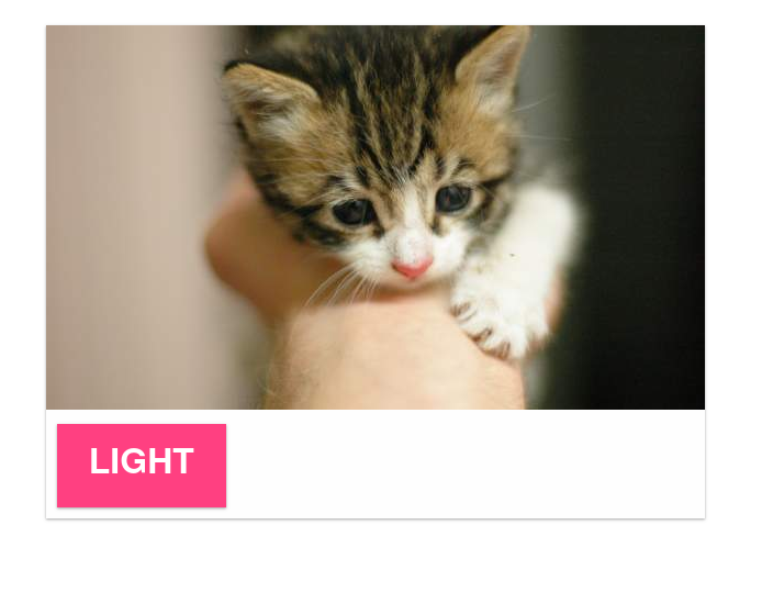
To illustrate the concepts of Styled Components I have built a very simple react app that renders a material card element that has a button that will change the theme of the card.


Currently code uses a CSS file and manipulates the classes on the components - the traditional way of doing things. As you can see in the demo, it works perfectly fine. But as you will see if you look at the code, it isn’t the easiest to reason about and there isn’t much scope for creating interesting dynamic behaviour easily.
For reference here is the code we currently have:
components/Card.js
1
2
3
4
5
6
7
8
9
10
11
12
13
14
15
16
17
18
19
20
21
22
23
import React from 'react';

export function Card({ children, theme }) {
  return (
    <div className={`card ${theme}`}>
      {children}
    </div>
  );
}

export function CardImage({ imgsrc }) {
  return (
    <img className="card-img" src={imgsrc} alt="alt text" />
  );
}

export function CardFooter({ children }) {
  return (
    <div className="card-footer">
      {children}
    </div>
  );
}
components/Layout.js
1
2
3
4
5
6
7
8
9
import React from 'react';

export function Container({ children }) {
  return (
    <div className="container">
      {children}
    </div>
  );
}
components/Button.js
1
2
3
4
5
6
7
8
9
10
11
12
import React from 'react';

export function Button({ children, theme, ...props }) {
  return (
    <button
      className={`btn ${theme}`}
      {...props}
    >
      {children}
    </button>
  );
}
App.js
1
2
3
4
5
6
7
8
9
10
11
12
13
14
15
16
17
18
19
20
21
22
23
24
25
26
27
28
29
30
31
32
33
34
import React, { useState } from 'react';
import './App.css';
import { Card, CardImage, CardFooter } from './components/Card';
import { Container } from './components/Layout.js';
import { Button } from './components/Button.js';

function App(props) {
  const [theme, setTheme] = useState('light');

  const toggleTheme = () => {
    const newTheme = theme === 'light' ? 'dark' : 'light';
    setTheme(newTheme);
  }

  return (
    <Container>
      <Card
        theme={theme}
      >
        <CardImage imgsrc="https://placekitten.com/600/350" />
        <CardFooter>
          <Button
            onClick={toggleTheme}
            theme={theme}
          >
            {theme}
          </Button>
        </CardFooter>
      </Card>
    </Container>
  );
}

export default App;
App.css
1
2
3
4
5
6
7
8
9
10
11
12
13
14
15
16
17
18
19
20
21
22
23
24
25
26
27
28
29
30
31
32
33
34
35
36
37
38
39
40
41
42
43
44
45
46
47
48
49
50
51
.container {
  width: 800px;
  margin: 0 auto;
  padding: 30px;
}

.card {
  box-shadow: 0 1px 3px rgba(0, 0, 0, 0.12), 0 1px 2px rgba(0,0,0,0.24);
  width: 600px;
  transition: color 0.3s ease, background-color 0.3s ease;
}

.card.light {
  background: #fefefe;
}

.card.dark {
  background: #454545;
}

.card-footer {
  padding: 10px;
}

.btn {
  font-weight: 600;
  box-shadow: 0 1px 3px rgba(0, 0, 0, 0.12), 0 1px 2px rgba(0,0,0,0.24);
  padding: 0.6em 0.9em;
  cursor: pointer;
  text-align: center;
  white-space: nowrap;
  text-decoration: none;
  text-transform: uppercase;
  display: inline-block;
  box-sizing: border-box;
  border: 0;
  border-radius: 0;
  outline: 0;
  transition: color 0.3s ease, background-color 0.3s ease;
}

.btn.light {
  color: #fff;
  background-color: #ff4081;
}

.btn.dark {
  color: #fefefe;
  opacity: 0.7;
  background-color: #676767;
}
You will notice we are also using some React hooks in this code. I won’t go into what they are or why they are cool here. But needless to say, I am planning to do a really in depth dive into React hooks very very soon.
The aim of the rest of the article will be to refactor this code to use Styled Components.
The Refactor
The first step is to add Styled Components as a dependency to our project.
yarn add styled-componentsOnce that has finished installing I will open up the Button component in src/components/Button.js and start the conversion process to Styled Components.
The first step is to import in the library at the top of the file:
import styled from 'styled-components';Then we will want to use that to recreate the Button component. Let’s quickly remind ourselves of what the old Button component looked like:
1
2
3
4
5
6
7
8
9
10
export function Button({ children, theme, ...props }) {
  return (
    <button
      className={`btn ${theme}`}
      {...props}
    >
      {children}
    </button>
  );
}
There is a lot of boilerplate here. We are creating an HTML button element, we are passing props down and we are using the children props inside the button. Styled Components abstracts all that boilerplate away from us and allows use to call styled.button to create a new button html element that passes props and uses children like we did above. Into that function we will pass a string of the CSS rules we want to apply.
Strange syntax
The way we call the styled.button function is not what you would expect though. This is the syntax:
1
2
3
export const Button = styled.button`
// css goes in here
`;
Strange right? Why are we using backticks? Why isn’t there () to call the function? What is going on here? This is actually a bit of ES6 syntax called “tagged template strings”.
1
2
3
4
// These are exactly equivalent.
myFunc`test`; // tagged template string

myFunc(['test'])
So we can put all of our CSS into that string and it will be passed in to the styled.button function.
I will copy in all of the CSS from the .btn class in the css file into the Styled Component definition.
1
2
3
4
5
6
7
8
9
10
11
12
13
14
15
16
export const Button = styled.button`
  font-weight: 600;
  box-shadow: 0 1px 3px rgba(0, 0, 0, 0.12), 0 1px 2px rgba(0,0,0,0.24);
  padding: 0.6em 0.9em;
  cursor: pointer;
  text-align: center;
  white-space: nowrap;
  text-decoration: none;
  text-transform: uppercase;
  display: inline-block;
  box-sizing: border-box;
  border: 0;
  border-radius: 0;
  outline: 0;
  transition: color 0.3s ease, background-color 0.3s ease;
`;
But why?
Why don’t we just pass in a normal string and call the function in the normal way using ()? The answer to this lies in the power that using backticks and tagged template strings allows. You may have seen something like this before:
1
2
const name = 'Adrian Henry';
const myString = `Hello my name is ${name}`;
When we use backticks, we can insert variables (or any valid javascript) as dynamic values into strings. That means that we can use that to create dynamic values in our CSS properties.
If we pass a function into the template string, styled-components will call that function and pass in the props that React gave that component! Wait what? That is incredible!
That means we can have functions that will take props and return a some value(s) that can be used in the CSS and they will automagically be applied to the component.
Here is a contrived example:
1
2
3
4
5
6
7
8
9
10
11
// Styled components will call the arrow
// function and pass in the props. We will
// always return '2rem' as the value which
// will be set as the padding. We are free
// to do whatever we want in that function.
// It is just a regular javascript function.

const Paragraph = styled.div`
  font-size: 1em;
  padding: ${props => '2rem'}
`;
We could also call a named function like this:
1
2
3
4
5
6
7
8
9
function getPadding(props) {
  // calculations
  return '2rem';
}

const Paragraph = styled.div`
  font-size: 1em;
  padding: ${getPadding} // calls the function above
`;
Moving on with the refactor.
In our CSS file we defined extra classes to apply the light and dark theme. But with our newly found knowledge of tagged template strings and the way styled-components will call the functions passed in, we can create some cool dynamic functionality that will apply the correct styles based on the desired theme:
1
2
3
4
5
6
7
8
9
10
11
12
13
export const Button = styled.button`
  // rest of css from above. Left out for brevity

  color: ${
    props => props.theme === 'light' ? '#fff' : '#fefefe'
  };
  opacity: ${
    props => props.theme === 'light' ? 1 : 0.7
  };
  background-color: ${
    props => props.theme === 'light' ? '#ff4081' : '#676767'
  };
`;
With that code in place we have a complete Styled Component in React! We are free to export that component and import it into the our main app and use it. When we use it, we can pass it a ‘theme’ prop that can be the values of ‘light’ or ‘dark’ and the component will style itself accordingly. That is pretty amazing.
Refactoring the other components.
Card.js
1
2
3
4
5
6
7
8
9
10
11
12
13
14
15
16
17
18
19
20
21
import React from 'react';
import styled from 'styled-components';

export const Card = styled.div`
  box-shadow: 0 1px 3px rgba(0, 0, 0, 0.12), 0 1px 2px rgba(0,0,0,0.24);
  width: 600px;
  transition: color 0.3s ease, background-color 0.3s ease;
  background: ${
    props => props.theme === 'light' ? '#fefefe' : '#454545'
  };
`;

export const CardFooter = styled.div`
  padding: 10px;
`;

export function CardImage({ imgsrc }) {
  return (
    <img className="card-img" src={imgsrc} alt="alt text" />
  );
}
Layout.js
1
2
3
4
5
6
7
import styled from 'styled-components';

export const Container = styled.div`
  width: 800px;
  margin: 0 auto;
  padding: 30px;
`;
With that all changed we can entirely remove the App.css file from our project because we are entirely using Styled Components to style the app. If you take a look at the code running in the browser you will see the functionality is exactly the same as it was before, but the code is much neater, much more dynamic and more inline with our mental model of components. A big win all around!
Some extra fun
At this point, I have achieve the aim of this article. But let’s quickly take a look at some of the cools things we can do now we are using styled-component.
Let’s hop back into the Button component. You will notice we are not setting a font-size anywhere in the css. Let’s add some dynamic functionality to allow the consumer of our Button component change the font size.
1
2
3
export const Button = styled.button`
  font-size: ${props => props.largetext ? '2em': '1em'};
`;
Now wherever we use the button we can set the largetext prop to make the text inside the button large and remove it to leave it at the default size:
1
2
3
4
5
6
7
<Button
  onClick={toggleTheme}
  theme={theme}
  largetext
>
  {theme}
</Button>
If we add that prop to the button in our app and take a look in the browser we will see this following:
Hopefully you can start to see the amazing power that this functionality provides you as a developer. You can create amazing functionality and wrap it up nicely in a component and give it to the rest of your team or publish it as an open source project and other people can use it and get all the dynamic styling without having to touch the CSS. That kind of power will really speed up your work and make everyone happier.
The ability to just focus on the business logic of your app and not get caught up in the tiny details is very refreshing. I’m sure you will agree that using styled-components just feels right.
And will that I would say we have a finished tutorial. I hope you know a little more about Styled Components than you did when you started reading this.
Stay hungry, and keep coding.
Adrian
Please give this post a share if you enjoyed it. Everyone needs that awesome friend to send them amazing stuff.