Amazing Parallax Effect in Pure JS
Please share this post if you enjoy it!
Parallax Effects Don’t Have To Be Annoying
Note: This is part one is a series where we will go from idea and hacky code to a generalised abstraction that we will publish as an open source library on NPM
I’m not gonna lie, parallax website’s don’t have the best reputation in certain circles, and rightly so. Too often the parallax effect is achieved through some kind of hijacking of the user’s scroll position on the page. This just leads to an awful experience that makes many hate the concept. However, there are plenty of good examples of this effect all over the internet.
The key to a good parallax website is a website where the user controls the scroll entirely but the scroll position directly informs what should be on the page. In other words, what is displayed on the UI is a pure function of the scroll position. Then the experience feels good. Almost as if scrolling through the page is like scrubbing through a video timeline. The website becomes a canvas for an interactive video type of experience.
In this article I want to try and create something just like that using pure javascript just to show how simple it can be to do it right.
What will we make?
Here is what we will be making:
You can also check the start of the video tutorial for a quick run through what we will be creating.
As you can see, we will create a pretty interesting 3d parallax effect that looks like we are moving through some mountains, some moving text animation and a typical scrolling parallax.
When I first started building websites this sort of thing seemed like it would be insanely difficult and well outside of my reach. But I am here to tell you that it really isn’t as hard as you may think. So let’s get started.
Scaffolding out the HTML and CSS
We will start will a simple HTML page and some css:
1
2
3
4
5
6
7
8
9
10
11
<!DOCTYPE html>
<html lang="en">
<head>
  <meta charset="UTF-8">
  <title>Turtle Parallax</title>
  <link href="main.css" rel="stylesheet" />
</head>
<body>
  <script src="index.js"></script>
</body>
</html>
1
2
3
4
5
6
7
8
9
code
* {
  margin: 0;
  padding: 0;
}

body {
  height: 5000px;
}
Note: Setting the body height to 5000px is arbitrary at this point as we just want something taller than the screen so we have something to scroll into. This can be made more clean and precise later on, but for now setting it at some random large value is fine.
Writing some javascript
You may have noticed we included a link to index.js in the html so let’s create that now and start things off by listening for scroll events.
1
2
3
4
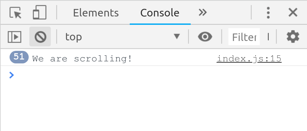
document.addEventListener('scroll', () => {
// do something on scroll
console.log('We are scrolling!');
});
Now if we open up the browser we can scroll a little and take a look at the console output:
Note: For ease I like to use an npm package called live-server which gives me live reloading of the browser while I develop. You can install it globally using npm install -g live-server and then run live-server in the project directory and the index.html will pop open in the browser ready for some live reloading goodness.
We need some html to work with
At this point we have a basic structure and we can listen to scrolling but we need some actual html on the page for us to manipulate while we scroll. So let’s create the initial mountain looking things.
Insert the following at the top of the body in index.html:
1
2
3
4
5
6
7
8
9
10
11
12
13
14
15
16
17
18
19
20
21
<div id="app">
<div class="fixed-section firstpage">
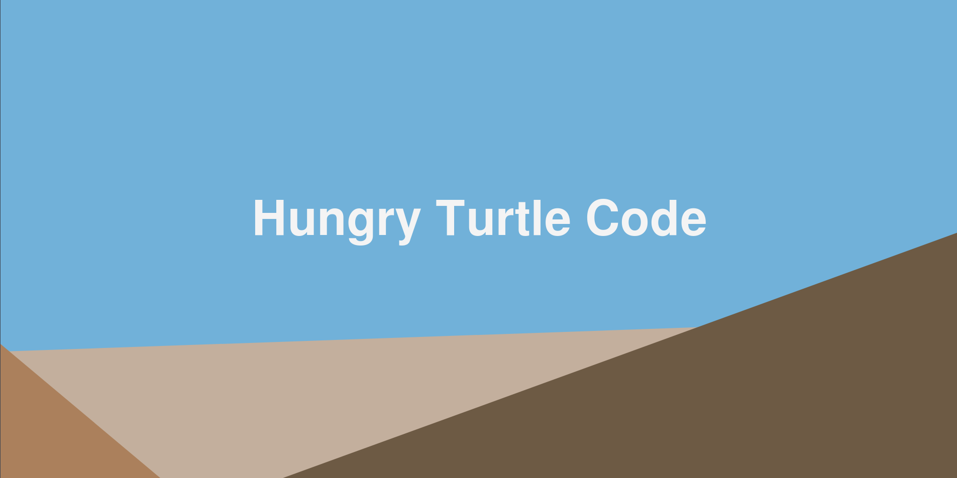
<h1 class="heading">Hungry Turtle Code</h1>
<div class="background">
<div class="bg-block"></div>
</div>
<div class="middleground">
<div class="mg-block"></div>
</div>
<div class="foreground">
<div class="fg-block"></div>
</div>
</div>
</div> <!-- end of #app -->
So we create a container for the whole application which we give the id app and inside that we have another wrapper for the “first page” of the application which will be the mountain fly through section. Inside that we have a title and three sections: background, middleground and foreground. Inside each of those is another div which will be the actual “mountain-y” parts.
The reason we have a div inside each section is so we can have a uniform anchor point to manipulate all the different sections. What I mean by this is that all the “mountain” sections are in a different place, so if we didn’t have each wrapped in a container they would all have different anchor points and if we started to scale them or transform them it will become a hot mess to keep everything consistent.
Instead we wrap each one in a container that will be the size of the whole window. Now we are free to place each element within the container to where ever we want and simply size it relative to the container. When it comes time to manipulate and transform each section we can instead manipulate the containers (which are all the size of the window and therefore have the same anchor point) and therefore everything remains consistent and we don’t have to deal with the mess of having different anchor points.
Probably illustrate this point in the video and link to a timestamp in the article
This is the css used:
1
2
3
4
5
6
7
8
9
10
11
12
13
14
15
16
17
18
19
20
21
22
23
24
25
26
27
28
29
30
31
32
33
34
35
36
37
38
39
40
41
42
43
44
45
46
47
48
49
50
51
52
53
54
55
56
57
58
59
60
61
62
63
64
65
66
67
68
#app {
  position: fixed;
  top: 0;
  left: 0;
  width: 100%;
  height: 100%;
}

.fixed-section {
  position: fixed;
  top: 0;
  bottom: 0;
  left: 0;
  right: 0;
  background: #71b1d9;
  z-index: 2;
}

.background,
.middleground,
.foreground {
  position: absolute;
  top: 0;
  bottom: 0;
  left: 0;
  right: 0;
}

.bg-block {
  background: #c3af9d;
  position: absolute;
  bottom: -10vh;
  left: 0;
  width: 100%;
  height: 40vh;
  transform: skewY(-2deg);
}

.mg-block {
  background: #ab805c;
  position: absolute;
  bottom: -45vh;
  left: -30vw;
  width: 100%;
  height: 40vh;
  transform: skewY(40deg);
}

.fg-block {
  background: #6d5a44;
  position: absolute;
  bottom: -45vh;
  left: 0;
  width: 100%;
  height: 60vh;
  transform: skewY(-20deg);
}

.heading {
  position: absolute;
  font-size: 5vw;
  left: 26vw;
  bottom: 24vw;
}

.firstpage h1 {
  color: #f4f4f4;
}
The core of what is going on here is that the whole firstpage section is position fixed, so that the scrolling won’t actually affect the elements. Each of the “mountain” sections are just divs that have been coloured and transformed using a skew transform to make them angled. The rest is just positioning the elements in the right place.
So now we have the following:
Make it move!
We have some html mountain-y things and we can listen to scroll. Let’s manipulate the html while we scroll.
Firstly, we will need to grab a reference to the elements we want to manipulate. So add the following to the top of your index.js script:
1
2
3
4
const fg = document.querySelector('.foreground');
const mg = document.querySelector('.middleground');
const bg = document.querySelector('.background');
const title = document.querySelector('.firstpage h1');
Then inside the scroll event listener we want to grab hold of the total scroll offset and define the length of the zoom animation through the mountains. This length will be a pixel value. For example if we define the length to be 500 then the animation will take 500 pixels of scrolling to complete.
1
2
3
4
5
document.addEventListener('scroll', () => {
  const yoff = window.pageYOffset;

  const MOUNT_SCALE_END = 500;
});
Immediately after that we will start the logic. We will check if the current scroll position is less than the end of the animation, then if it is we will scale the mountain divs and the title. We create the illusion of 3d by scaling the elements “closer” to us more than the elements “far away”.
1
2
3
4
5
6
7
8
9
10
11
12
13
document.addEventListener('scroll', () => {
  const yoff = window.pageYOffset;

  const MOUNT_SCALE_END = 500;

  if (yoff < MOUNT_SCALE_END) {
    const perc = yoff / MOUNT_SCALE_END; // how far through the animation are we?
    fg.style.transform = `scale(${1 + 0.4 * perc})`;
    mg.style.transform = `scale(${1 + 0.1 * perc})`;
    bg.style.transform = `scale(${1 + 0.04 * perc})`;
    title.style.transform = `scale(${1 + 0.35 * perc})`;
  }
});
Note: We are using template strings to allow us to add variables into the string easily without having to do lots of string concatenation.
The first thing that we did to actually manipulate the elements is to normalise the pageYOffset to represent a percentage of the animation that is completed by dividing the offset by the end of the scaling mountain section.
Once we have that percentage we can scale the different elements using it by multiplying the percentage by some constant to get different scaling on each element.
The end result is a beautiful parallax zoom effect when we start to scroll that just stops when we reach 500 pixels of scroll down the page.
Section 2
Next thing to do is add in the second section. The first thing I’ll do towards that is create a fade out transition that will later lead into the second section.
We will change the opacity of the .firstpage element so we will need to grab hold of it. So at the top of the script add the following:
1
const firstpage = document.querySelector('.firstpage');
Under the other timing constant we created called MOUNT_SCALE_END I will add another constant that will mark the end of the transition period into the second section:
1
const TRANSITION_END = 800;
Then we can add an else if statement to the if block we currently have to check if the offset is within the boundary of the transition:
1
2
3
4
5
6
if (yoff < MOUNT_SCALE_END) {
  // code from above
} else if (yoff < TRANSITION_END) {
  const perc = (yoff - MOUNT_SCALE_END) / (TRANSITION_END - MOUNT_SCALE_END);
  firstpage.style.opacity = `${1 - perc}`;
}
Same kind of idea here, we calculate the percentage we are through the transition and change the opacity based on that percentage.
The calculation for percentage is a bit trickier this time because the transition doesn’t start at 0, it starts at the end of the mountain scaling part so we have to take MOUNT_SCALE_END away from the offset to get the starting point and now because we have normalised the start by taking away MOUNT_SCALE_END we also have to take it away from the end point.
Now as we scroll down the mountains will fade away nicely. But we want the second section to show underneath as it fade. So let’s create the markup for that section now.
Slight issue
You might notice a small issue with the current code if you tinker with the scrolling in the browser. That issue is if you scroll down past the transition then scroll back up really quickly, the opacity of the first section may not go all the way back to 1. This is because you scrolled so fast that the scroll events couldn’t be called quickly enough to change the opacity back before we where outside the transition code and back into the scaling code.
To fix this problem inside the if statement where we do the scaling we should add some code to make the opacity of the first section 1 to guarantee it will be reset even if we scroll really fast.
1
2
3
4
5
6
7
if (yoff < MOUNT_SCALE_END) {
  // rest of scaling code

  firstpage.style.opacity = '1';
} else if (yoff < TRANSITION_END) {
  // transition code
}
Section 2 Markup
Here is the html to add just below the firstpage markup:
1
2
3
4
5
6
7
8
9
10
11
<div class="fixed-section secondpage">
  <h1 class="heading">
    <span>Hungry</span>
    <span>Turtle</span>
    <span>Code</span>
  </h1>
  <img
    src="https://res.cloudinary.com/djxscnpzf/image/upload/v1538571617/hungryturtle_high3_af4hyq.png"
    class="turtlemascot"
  >
</div>
As you can see we have used the .fixed-section class again so this will have the same base style as the first page. We also reuse the .heading class because we want to title to look the same as before as we fade into the second section.
We put each word of the title into it’s own span so we can hook into each word and transform them individually later.
We will also add the following extra styles:
1
2
3
4
5
6
7
8
9
10
11
12
13
14
15
16
17
18
19
20
.secondpage {
  background: #cabaad;
}

.secondpage h1 {
  color: #fdeabf;
  transform: scale(1.35);
}

.secondpage h1 span {
  display: inline-block;
}

.turtlemascot {
  position: absolute;
  width: 40vw;
  left: 32vw;
  bottom: 17vw;
  transform: scale(0);
}
The thing to note here is that we are setting the scale of the h1 to 1.35. Why? Well in the first section we are scaling the title and the scale uses a constant of 0.35, meaning that at the end of the animation the title is scaled to 1.35. We want the heading in the second page to exactly match up with the title in the first, so we need to scale it to 1.35 too so it matches. The turtle mascot also starts at scale 0 so it can be scaled up as the scroll happens.
Animate the title
First things first, we need to get hold of the title in the javascript:
1
const titleParts = document.querySelectorAll('.secondpage h1 span');
You can probably tell what is coming at this point. We need to specify the end of the title animation as a constant then add another else if to check if we are inside the title transition animation boundary.
1
2
3
4
5
6
7
8
9
10
11
12
13
14
15
16
17
// Other constants defined here
const WORD_SPLIT_END = 2300;

if (yoff < MOUNT_SCALE_END) {
  // Mountain scaling code
} else if (yoff < TRANSITION_END) {
  // Transition code
} else if (yoff < WORD_SPLIT_END) {
  const offset = yoff - TRANSITION_END;
  titleParts[0].style.transform = `translate3d(0, -${offset}px, 0)`;
  titleParts[1].style.transform = `translate3d(0, 0, 0)`;
  titleParts[2].style.transform = `translate3d(0, ${offset}px, 0)`;

  if (offset > 300) {
    titleParts[1].style.transform = `translate3d(-${offset - 300}px, 0, 0)`;
  }
}
As always we have normalised the offset by subtracting the end of the previous section then used that value to transform the translate3d property. Notice that we initially don’t do anything to the middle part of the title, but then if the normalised offset is greater than 300 then we start moving the middle part. This is how we delay the animation of the middle part, as you saw in the demo.
Scale the Turtle
Grab a reference to the turtle image:
1
const mascotimg = document.querySelector('.turtlemascot');
Then calculate the percentage through the scaling and update the scale using that percentage:
1
2
3
4
5
6
7
8
9
10
11
12
13
14
15
if (yoff < MOUNT_SCALE_END) {
  // Mountain scaling code
} else if (yoff < TRANSITION_END) {
  // Transition code
} else if (yoff < WORD_SPLIT_END) {
  // Rest of title animation

  if (offset > 500) {
    const perc = Math.min(
      1,
      (offset - 500) / (WORD_SPLIT_END - TRANSITION_END - 500)
    );
    mascotimg.style.transform = `scale(${1.2 * perc})`;
  }
}
Again, the percentage calculation here is slightly tricky. Ultimately it is just the offset divided by the length of the animation. The offset is just what we had before and the duration of the animation is calculated by subtracting the end of the previous section from the end of the current section. However, because we are only starting at 500 pixels we need to subtract 500 from both sides. Then we just do Math.min that value with 1 to make sure we never get a value larger than 1.
Section 3
The third and final section is more of a traditional scrolling with parallax kind of deal.
Here is the markup:
1
2
3
4
5
6
7
8
9
10
11
12
13
14
15
<div class="thirdpage">
  <div class="progress-line">
  </div>

  <div class="title">
    <h2>Hello Parallax</h2>
  </div>

  <div class="imgs">
    <img class="img img1" src="https://placekitten.com/g/400/400">
    <img class="img img2" src="https://placekitten.com/g/400/500">
  </div>

  <div class="bottom-sect"></div>
</div>
And the css:
1
2
3
4
5
6
7
8
9
10
11
12
13
14
15
16
17
18
19
20
21
22
23
24
25
26
27
28
29
30
31
32
33
34
35
36
37
38
39
40
41
42
43
44
45
46
47
48
49
50
51
.thirdpage {
  transform: translate3d(0, 100vh, 0);
  background: #231f20;
  padding-top: 50px;
}

.thirdpage .title {
  display: flex;
  align-items: center;
  justify-content: center;
  font-size: 2vw;
}

.thirdpage .imgs {
  margin: 100px 0;
  position: relative;
}

.img {
  position: absolute;
  display: block;
  top: 10vw;
}

.img1 {
  left: calc(50vw - 350px);
}

.img2 {
  left: calc(50vw - 50px);
  top: 16vw;
}

.thirdpage .title h2 {
  color: #c2c2c2;
}

.bottom-sect {
  height: 1000px;
}

.progress-line {
  position: absolute;
  width: 2px;
  background: red;
  height: 100%;
  left: 5vw;
  top: 0;
  transform: translate3d(0, -100%, 0);
  z-index: 0;
}
As always, we will have to grab hold of the elements we want to manipulate. In this case we obviously need to grab the images we are going to parallax, but we are also going to grab hold of the whole app container too.
1
2
3
const app = document.querySelector('#app');
const imgs = document.querySelectorAll('.imgs .img')
const progressLine = document.querySelector('.progress-line');
Strange way of scrolling
To make this section scroll we are going to need to do some trickery. The reason for this is the first two sections have been position: fixed because we wanted them to remain still while we scrolled and only animate the elements within. However now we want everything to scroll, including the fixed position second section.
The best way to achieve that is to make the whole app container fixed position (we have actually already done that above, sneaky huh?) and then translate3d the position of the app container at the same pace as the window is scrolling. That will give the visual sense that we are actually scrolling, while we are actually just translating the container at the same pace as the scrolling.
1
2
3
4
5
6
7
8
9
10
11
12
13
14
15
16
const END_OF_PAGE = 3450;

if (yoff < MOUNT_SCALE_END) {
  // Mountain scaling code
} else if (yoff < TRANSITION_END) {
  // Transition code
} else if (yoff < WORD_SPLIT_END) {
  // Title animation code
} else if (yoff < END_OF_PAGE) {
  const offset = yoff - WORD_SPLIT_END;
  const duration = END_OF_PAGE - WORD_SPLIT_END;

  app.style.transform = `translate3d(0, -${offset}px, 0)`;
  imgs[0].style.transform = `translate3d(0, -${offset * 0.1}px, 0)`;
  imgs[1].style.transform = `translate3d(0, -${offset * 0.25}px, 0)`;
}
The code above should look pretty familiar to you at this point. We are normalising the total offset to be the offset for just this section by subtracting the end of the previous section. Then we calculate the duration of the scrolling by subtracting the end of the last section from the end of the current section. The duration will be used shortly.
The calculated offset is then used to translate the app container to simulate the scrolling as mentioned. We also translate each of the pictures by two different constants multiplied by the offset. By using two different values here we are creating the parallax effect because each image is moving at a different pace.
The progress bar
The last thing to do now is to add the red bar that tracks the progress of the parallax scrolling section.
We don’t want to trigger the progress bar Immediately so we will use similar logic to what we used in the logo scaling code above.
1
2
3
4
5
6
7
8
9
10
11
12
13
14
15
16
17
18
19
20
if (yoff < MOUNT_SCALE_END) {
  // Mountain scaling code
} else if (yoff < TRANSITION_END) {
  // Transition code
} else if (yoff < WORD_SPLIT_END) {
  // Title animation code
} else if (yoff < END_OF_PAGE) {
  // rest of scrolling code

  const progressTrigger = duration * 0.2;

  if (offset > progressTrigger) {
    const progressDur = duration - progressTrigger;
    const progressOff = offset - progressTrigger;
    const progress = Math.min(1, progressOff / progressDur) * 100;
    progressLine.style.transform = `translate3d(0, -${100 - progress}%, 0)`;
  } else {
    progressLine.style.transform = `translate3d(0, -100%, 0)`;
  }
}
Here we calculate the offset and duration for the progress bar and then calculate the percentage progress that we then use to transform the div (which is translated -100% in the css). We add the else block to ensure that we reset the state of the progress bar position when we are outside of the boundaries of the progress bar animation. This is a similar fix to what we showed earlier regarding bugs created by scrolling to fast and not correctly resetting the opacity of the first section.
Fixing the bugs
If you tinker with the web page in the browser and scroll around you will notice that there are a few other issues where we are not correctly resetting an elements state when we scroll around fast. We will clean up those bugs now.
The first issue you may notice is that we are not resetting the title position back to 0 if we scroll back up through the title animation quickly. To fix that we will reset it to zero in the transition section like so:
1
2
3
4
5
} else if (yoff < TRANSITION_END) {
  titleParts[0].style.transform = `translate3d(0, 0, 0)`;
  titleParts[2].style.transform = `translate3d(0, 0, 0)`;
  titleParts[2].style.transform = `translate3d(0, 0, 0)`;
}
A slightly more subtle bug is that if you refresh the page when you are in section two or three then scroll back up to section one, there will be a flash as the scaling of the “mountain” parts kicks in. This is because the scale starts off at 1 and scales up to some larger value during the section one animation. However if we refresh the page in section three then that animation in section one has never run and therefore the scale is still at 1 when we scroll back through the transition phase but as soon as we hit the section one animation again it will pop back up the larger scaled values.
So we need to reset the scale to the larger values before we enter back into the transition section. We will also reset the opacity to 0 ready to enter into the transition that will transform that back to 1. Add this to the word animation block:
1
2
3
4
5
6
7
8
9
} else if (yoff < WORD_SPLIT_END) {
  title.style.transform = `scale(1.35)`;
  fg.style.transform = `scale(1.4)`;
  mg.style.transform = `scale(1.1)`;
  bg.style.transform = `scale(1.04)`;
  firstpage.style.opacity = `0`;

  // rest of word animation code
}
The same issue exists for the turtle image. We scale it up to 1.2 but don’t reset it to 1.2 in the next section to avoid possible flashes when we scroll back.
1
2
3
4
5
} else if (yoff < END_OF_PAGE) {
  mascotimg.style.transform = `scale(1.2)`;

  // rest of scrolling code
}
The final bug is pretty subtle and may not actually matter that much. The bug is that we are removing the first page from view simply by changing the opacity to 0, but the elements are still actually there, on top of everything else on the page, we just can’t see it. That means if we try to select text or something it won’t work because we are actually clicking on the invisible first page.
We will fix this by making the display of the page none when it isn’t in view and changing it to block when it comes back into view:
1
2
3
4
5
6
7
8
9
10
11
if (yoff < MOUNTAIN_SCALE_END) {
  // mountain scale code
} else if (yoff < TRANSITION_END) {
  firstpage.style.display = 'block';

  // rest of transition code
} else if (yoff < WORD_SPLIT_END) {
  firstpage.style.display = 'none';

  // rest of word animation code
}
And there we have it! A completed (but hacky) implementation of a nice parallax effect using pure Javascript. I really hope you enjoyed it and I look forward to seeing you in the next part where we will take this code, clean it up and convert into a generalised library that we will publish to NPM so anyone can create amazing parallax sites like this with ease! See you then.
Stay hungry, and keep coding.
Adrian
Please give this post a share if you enjoyed it. Everyone needs that awesome friend to send them amazing stuff.