AngularJS Quiz App Tutorial Part 10 - Ng-Class
Please share this post if you enjoy it!
Getting Stylish With Ng-Class
Moving swiftly on to the markup for the quiz page in our application. The first thing we will tackle is the progress area and the legend. If you can’t remember what these sections look like, take a look in the video or check the application We will introduce a new directive to style the progress buttons – ng-class. This will add styles based on conditions we specify.
If you want to see the app for yourself, check it out here.
The git repo can be found here.
The next part can be found here
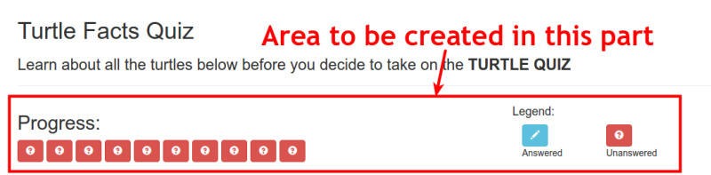
Hopefully you have noticed, or realised that there is a button for every question in the quiz and they are all styled the same initially. This means we can use the ng-repeat directive to cut down on the code we need to write.
For us to have use ng-repeat to count the questions, we will need access to the questions in the view. We have already injected the data service into the controller. So no we just need to create a property that is attached to the view model.
1
2
3
4
5
6
7
8
function QuizController(quizMetrics, DataService){

  var vm = this;

  vm.quizMetrics = quizMetrics;
  vm.dataService = DataService;

}
Some Bootstrap HTML
We will contain the whole progress and legend area in a Bootstrap row. The progress bar will take up 8 columns and the legend the remaining 4. Fortunately, Bootstrap contains a nice class to style an area with a lot of buttons. It is called .btn-toolbar
1
2
3
4
5
6
7
8
9
10
11
12
13
14
15
<div ng-controller="quizCtrl as quiz" ng-show="quiz.quizMetrics.quizActive">

  <div class="row">
    <div class="col-xs-8">
      <h2>Progress:</h2>
      <div class="btn-toolbar">

      </div>
    </div>

   // LEGEND AREA GOES HERE

  </div>

</div>
Inside the button toolbar we want a button for each of the questions in the quiz. These buttons will be styled to let the user know if they have answered that question or not and they will also allow the user to navigate between questions.
The ng-repeat directive will go onto the button markup and will loop for the total number of questions.
1
2
3
4
5
6
<div class="btn-toolbar">
  <button class="btn"
        ng-repeat="question in quiz.dataService.quizQuestions">

  </button>
</div>
In Walks The Ng-Class Directive
Ng-class is a directive like any other. But this time, inside the quotes we put an object that contains name:value pairs. The name will be the class we want to add and the value will be the conditional expression or boolean that will determine whether or not that class should be added. We can add multiple name:value pairs if we want, each with their own class and condition.</span>
1
2
3
4
5
6
7
<div class="btn-toolbar">
  <button class="btn"
          ng-repeat="question in quiz.dataService.quizQuestions"
          ng-class="{'btn-info': question.selected !== null, 'btn-danger': question.selected === null}">

  </button>
</div>
Here, btn-info and btn-danger are the two respective classes that will be added and the conditions are if the selected flag of the current question is not null or is null respectively.
Glyphicons Also Join The Party
Now that we have the correct colouring to the buttons we need to add the icons. As you have see from the example, and answered question has the pencil icon while the unanswered has the question mark.
To do this will will use Glyphicons that come bundled with Bootstrap, which will be added to a span inside the button. Again, we will use ng-class to add either the glyphicon-pencil class or the glyphicon-question-sign class depending on if the question is answered or not.
1
2
3
4
5
6
7
8
9
10
<div class="btn-toolbar">
  <button class="btn"
          ng-repeat="question in quiz.dataService.quizQuestions"
          ng-class="{'btn-info': question.selected !== null, 'btn-danger': question.selected === null}">

              <span class="glyphicon"
                    ng-class="{'glyphicon-pencil': question.selected !== null, 'glyphicon-question-sign': question.selected === null}"></span>

  </button>
</div>
Now Here Comes The Legend
Inside the same row we created for earlier we will add the legend area. This area doesn’t have any fancy directives as it doesn’t need to change throughout the lifetime of the application. It can be hard coded.
We will make the area the remaining four columns. The markup isn’t complex so I won’t waste your time by explaining it. I will just show you it.
1
2
3
4
5
6
7
8
9
10
11
12
13
14
15
16
17
<div class="col-xs-4">
  <div class="row">
    <h4>Legend:</h4>
    <div class="col-sm-4">
      <button class="btn btn-info">
        <span class="glyphicon glyphicon-pencil"></span>
      </button>
      <p>Answered</p>
    </div>
    <div class="col-sm-4">
      <button class="btn btn-danger">
        <span class="glyphicon glyphicon-question-sign"></span>
      </button>
      <p>Unanswered</p>
    </div>
  </div>
</div>
This markup goes directly below the markup for the progress area but still inside the row. Refer to the first HTML snippet on this page above, there is a comment showing where the legend markup goes.
On To The Next One
Out application is really taking shape now. In the next part we will build the markup for the question area itself.
See you over in part 11.
Adrian
Please give this post a share if you enjoyed it. Everyone needs that awesome friend to send them amazing stuff.